Olympia Anima
A reliable platform for booking bridal alterations and wedding dress services, providing a seamless and stress-free experience for customers.
OVERVIEW
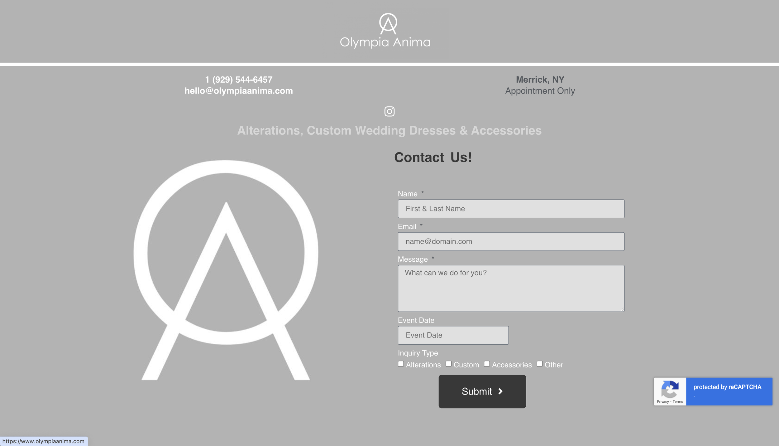
The original website did not meet the accessiblity guidelines in terms of color and there was lack of user flow.
The task was to redesign UX/UI of the overall site through: recreating the wireframes, and competitive analysis, to support user-friendly and provide an easy user experience.
ROLES
UI/UX Designer
Redesigned the website with wireframes and high-fidelity screens
Created User Flows for Website layout
PROJECT SPECIFICATIONS + DELIVERABLES
Duration: 2 Weeks
Deliverables:
High-fidelity interactive prototype on Figma
User Flows
Site Maps
Problem
Website layout/structure: Site map was unclear and user flow was confusing.
Unclear Calls to Action: Ambiguous designed labels that do not guide users effectively toward desired actions.
Solution
Create interfaces that meet the color accessibility guidelines for UX Design
Redesign the user flow to enhance the intuitive user experience
Easy to understand fillable forms (ie. Leaving Reviews and Submissions )
“I would love for my website to be romantic and light… ”
— Jilian D. , CEO of Olympia Anima
RESEARCH
Crafting for Success: Mastering Design Through Comparative Analysis
In the UX research process, a competitive analysis was completed to gain insights from websites of various local alteration stores.
By organizing the groups and analyzing their key features, we identified essential elements, including user-friendly reviews and examples of past work. In the end, we chose to integrate these insights into our design strategy.
Design meets Function: Usability Testing
Due to the constraints of time and resources, one round of usability testing was completed. The user was asked to navigate through the original website during the first round. Questions were asked, such as what do you see, how do you navigate the website, etc., to determine user needs. During the second round of usability testing, the initiate prototype was given to the users. The users reported that “text was easier to read” and liked the ease of the navigation between the pages.
Initial Screens of the website
PROTOTYPE + TEST
Style Guide
The style guide was formed based on our client’s feel for the website (romantic and light).
Final Protoype
Users can easily access each page using the toolbar on top. The call-to-action button allows user to easily navigate to the alteration page.
Reviews of the company can be seen to promote and support the company’s work. The user can also view reviews from past customers.
Using the results from user testing, the Request Form has been simplified to target the main areas of concern.
WRAP UP
Reflection
I had the opportunity to explore and deepen my understanding of accessibility factors that support universal design, applying them to this project.
Throughout the three weeks, I was able to keep active communication with the stakeholders to determine something that met their needs as advocating the user’s needs. It enabled the balance of functionality and design while maintaining the user experience as the top priority.
Future Considerations
Some considerations for the future projects is to design the other components, such as a Marketplace / E-commerce.


