Pebbles Community
Fostering a community and providing shared resources to assist Japanese immigrants and expats
OVERVIEW
Our team had the opportunity to work with the CEO of Pebbles Community. Her vision was to create a mobile web platform to foster a community and provide shared resources to assist Japanese immigrants and expats. The client approached us with an existing website that had poor wireframing and lacked clear objectives.
Our task was to recreate the wireframes, redefine the project's objectives, and create a mobile web platform that would be user-friendly and provide an engaging experience for the users.
ROLES
UI/UX Designer
Worked with UX team to conduct user research
Created Design Systems for the Product
PROJECT SPECIFICATIONS + DELIVERABLES
Duration: 4 Weeks
Deliverables:
High-fidelity interactive prototype for key tasks in English and Japanese
User Flows
Site Maps
Low fidelity wireframes and prototypes
Usability tests and findings
Problem
Website layout/structure: Site map was unclear and user flow was confusing
Dual Language Option: Both Japanese and English platform
Priorities: List of priorities provided by the client were inconsistent among the duration of the project
Time Frame: Time Constraint of 4 weeks made it difficult to complete all 6 components
Solution
With compromise and collaboration among all team members, we were able to determine the high priority components of the app: Community
The Community component includes: Groups, Topics and Messaging among Users
Japanese/English Toggle was created to allow users to easily switch between the two languages
“I want to create an easier way for our Japanese Community to share resources with each other...”
— Karmen Too, Creator of Pebbles Community
RESEARCH
Designing for Success: Drawing Inspiration from similar platforms
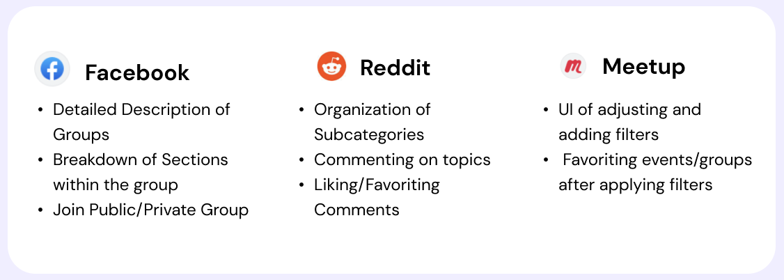
In the UX research process, we leveraged competitive analysis to gain insights from popular social applications like Facebook, Meetup, and Reddit. By categorizing the groups and examining their key features, we identified important aspects that could inform the development of our own app. Ultimately, we decided to incorporate these findings into our design strategy.
Design meets Function: Usability Testing
Two rounds of Usability Testing was completed. The first round took place on the third week of the project. A testing script was created and given to our client to test with the intended audience (Japanese immigrants and expats).
It was translated by the client, whom was a Japanese speaker to Japanese, and tested with 3 Japanese participants. The other two users were English-speaking to help determine the user flow and functionality of the app.
ROUND 1
“What is going on with this Topics page?”
“Why would I want to switch the toggle from ENG to JPN?”
“There is too much information, I don’t know where to go”
PROTOTYPE + TEST
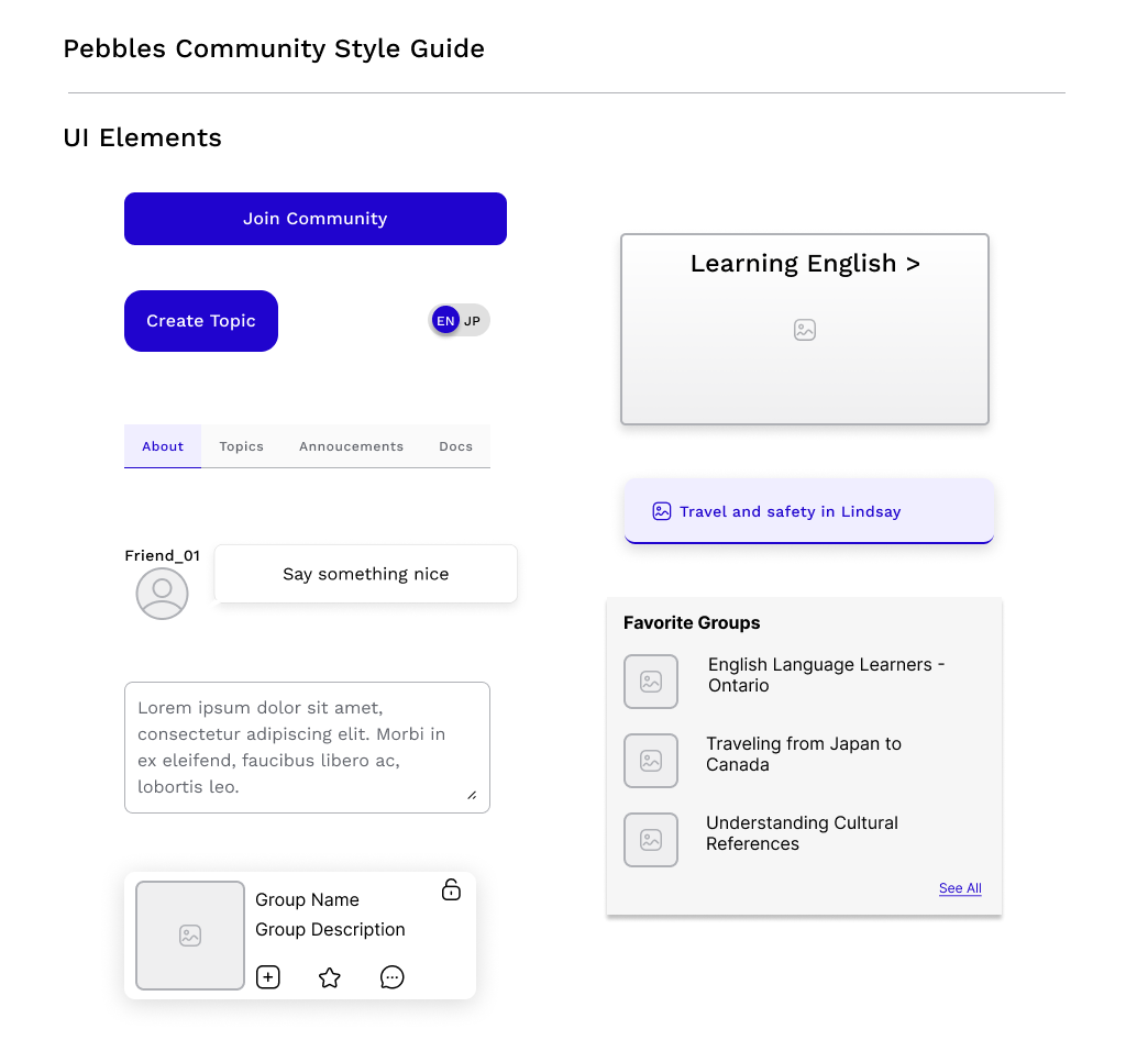
Style Guide
Findings from Round 1 of Usability Testing, the users reported:
There was confusion with the terminology and organization of the infrastructure among all the participants
The English and Japanese toggle was distracting and not commonly used among the participants
The pages were overwhelming and overflow of information
ROUND 2
“It would make it easier with text underneath the top navigation icons”
“I love how simple it is to use the ENG to JPN toggle, and it is not in your face”
“I think I can see events in the area if I see the title of 地域情報, maybe change name to 生活情報”
Based on the user feedback and observations, adjustments were made towards the layout of the groups page. The color of the JPN/ENG toggle was also muted, as it was not a commonly used button.
From the findings from Round 2 of Usability Testing, the users reported:
Japanese terminology was not translated correctly
The different color and labels allowed users to understand icons in the navigation bar, decreased confusion among users
The filter option allowed users to easily search topics of their choice
The style guide was formed based on our client’s feel for the app (trustworthy and fun).
High Fidelity Prototypes
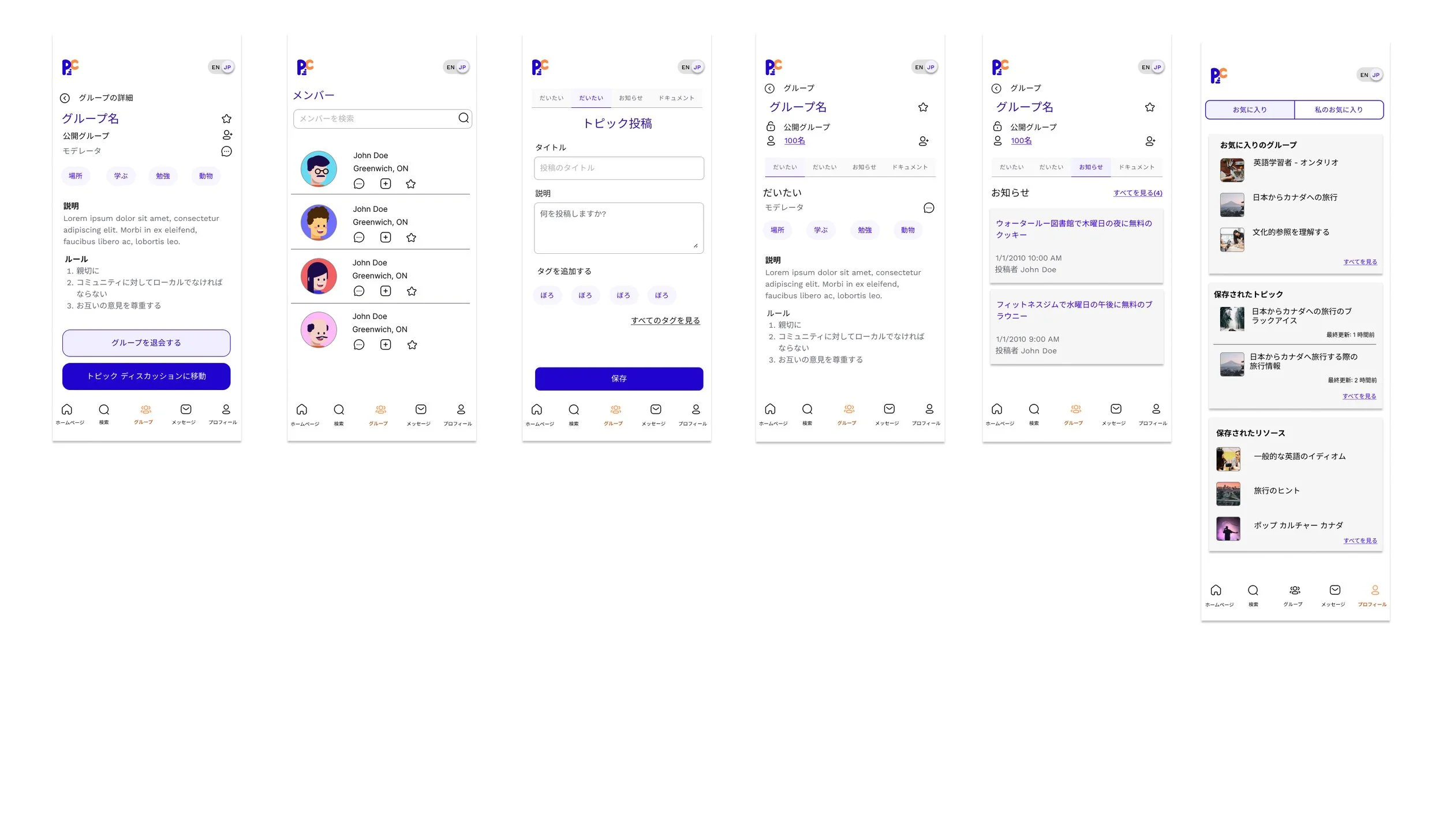
Within the group page, the user can navigate between the different tabs. These tabs include About, Topics, Announcements and Resources.
Users can easily create groups, add tags and change the privacy setting of the group (private/public)
In public groups, users have the option to join and leave the group. Then, the user can access the topics within the group.
Users can customize their profiles and message other users within the Pebbles Community.
WRAP UP
Reflection
I was able to collaborate with other members of the UI/UX team. We were able to divide the project into research and design to create a function mobile web interface for the Pebbles Community. We also worked closely with our client, whom was also the software engineer.
Throughout the four weeks, the scope of the project was consistently changing and it was difficult to provide a final product within the given timeframe. Due to language barriers, some of the test sessions were also completed in Japanese by the client. In conclusion, there might have been some bias with the results from our client.
Overall, it was a great experience working and collaborating with other disciplines. It allowed us to compromise functionality and design while keeping the user experience as a priority.
Future Considerations
Some future considerations for the future design team is to design the other components of the Pebbles Community, such as the Marketplace, Study Buddy and Digital Library.
Within the Social Component:
Allow users to favorite other users
Public Group Invites
Private Profile Page (listed under Profile in requirements)
Group Listing (request/join private groups)


